Microsoft Zune
For today’s entry in my never-ending “Zscaler Logo on an Old, Unusual or Obsolete Device” series, I present one of the greatest “also ran” products in recent tech history: the Microsoft Zune!
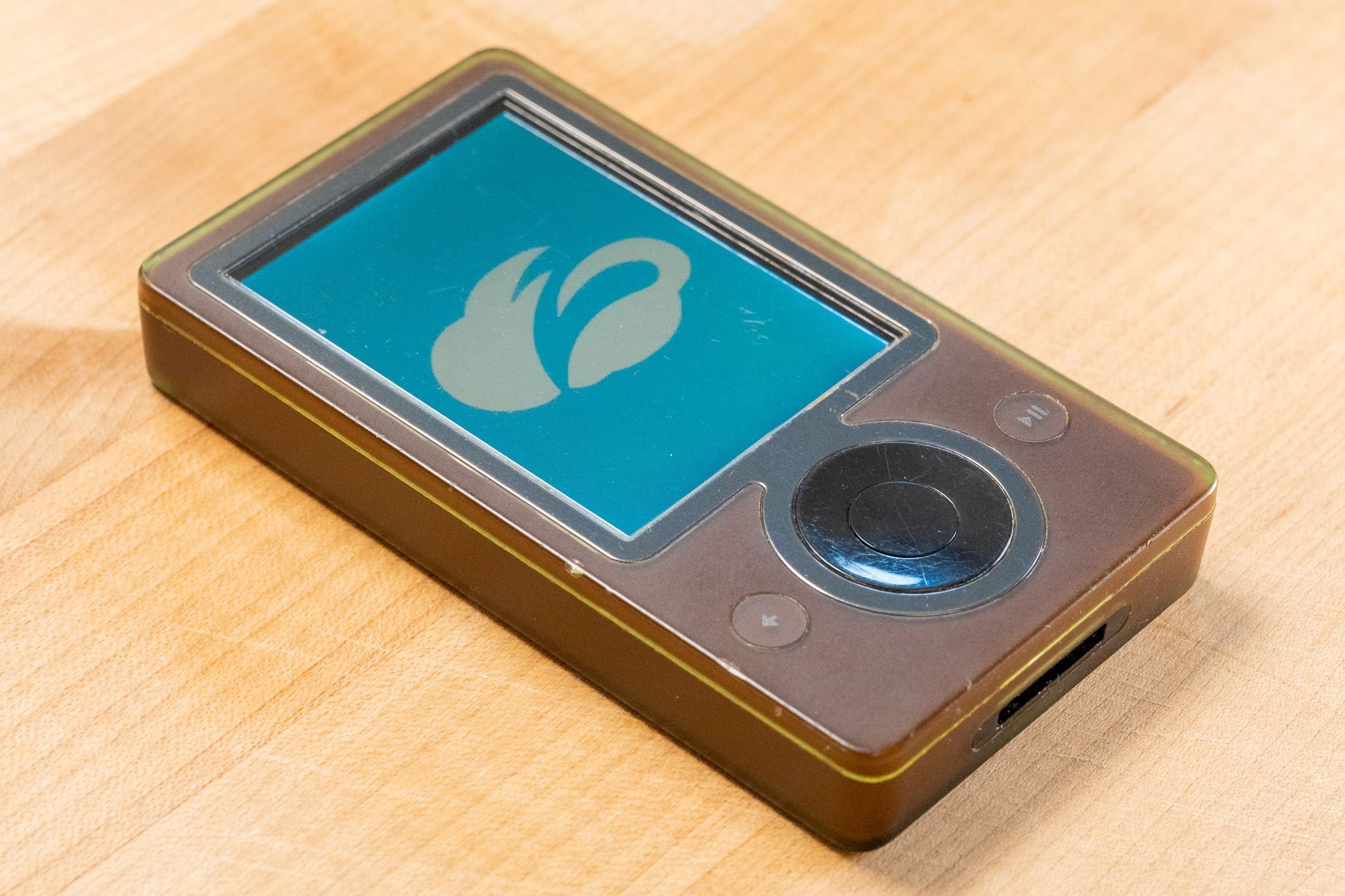
The Zune was Microsoft’s attempt in 2006 to join the portable digital music revolution jumpstarted by Apple’s iPod. In typical Microsoft fashion they took obvious inspiration from the iPod before adding a very “Microsofty” bundle of high-tech features and oddball design quirks.Where Apple’s iPod line (especially in those early years) offered a sort of understated elegance, the Zune went hard the other direction. Sporting a distinctive brown color which looks much nicer in person than it looks in photos, the oddball style of the device was a significant impediment to its success from the moment it was released.
Aesthetics aside, the Zune offered a range of interesting and advanced capabilities far beyond the iPods of that time. Users could use its 30GB mechanical “microdrive” hard disk to store and play back music and videos, as well as installing a small collection of optional games. WIth a taller screen than typical iPods of that time, the Zune was actually an improvement for watching videos in ‘landscape’ orientation when compared to iPods of that time.
Interestingly, the Zune includes a built-in FM radio tuner which could ‘tag’ songs heard on the radio for future purchase from the Zune Marketplace online store - a compelling feature in the era before apps like Shazam made it easy to identify songs. Also, the Zune has built-in WiFi which enables Zune users to wirelessly “squirt” (yes, that’s the official term) a song to another Zune owner, who can then play it back a few times before being prompted to purchase the track for themselves. Given how intensely the music recording industry was fighting against any kind of user-to-use music sharing in those days, this feature is quite impressive in both a technological sense, and with regard to the presumably complicated arrangements Microsoft worked out with record companies.
Also of note was the user interface found on the Zune, which was a direct precursor to the “Metro” UI later found on Windows Phone and Windows desktop systems. The Zune interface feels much more ‘flashy’ than the iPod, with large text dynamically zooming forwards and backwards in 3D as you click through its menus. It’s also one of the earliest implementations of the ‘flat’ design aesthetic which is now almost totally pervasive across tech products. I personally prefer the ultra-simplistic iPod menu system, but I have to admit that the Zune’s UI feels far more modern to a user in 2023 than a 2006-era iPod does.
Anyway, I hope you’ve enjoyed this latest entry in my series. Happy Friday!